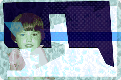
So after stepping back from the last two designs I did, I liked them put wanted to push it a little further, I wanted to try and mix the old with the new. The old fashioned wallpaper was just a bit too domineering on the spread I taught and the more modern twist was too plain and simple but I still wanted to use elements from both. So went back to the drawing board and tried to bring them together concentrating on the background first in illustrator. Some were an absolute disaster but I think I got there eventually. I really like the third one here but wasn't really loving the colour pallet so messed about with that until I was happy.
Next Step was bringing in the copy, eventually I got it to fit in the space (took a while!), really happy with the outcome. It jazzes up the story a bit making it look more interesting than it actually is (no offence Tracey!) I decided to go with a very clean type for the title and quote and kept it pretty simple mixing bold and light styles. Tried a little smiley face in the quote??? Not sure about it, kind of like it on it's own but not sure about it in the spread? Also played with the quotation marks, making them little characters but I just think I'm going too far now so gonna stop! So the last one here is my final piece..hope you like!


This is really cool
ReplyDeletelove the vintage kinda vibe in these! very origonal.
ReplyDeletep.s. i dont think u went "to far" with the quotations i actually giggled a lil bit when i seen them... never have i seen one that happy! hehe :]
Looking good Sandra,
ReplyDeleteDinner at the cuffes, sounds and looks like a sit com.
What size is you body copy running at, looks a bit large, but maybe not?
PL
Thanks Padraic, ya now that you say it, it does look a bit like an old sitcom like the Cosbys or Family Ties!
ReplyDeleteThe first paragraph is only 10pt and the rest is then 8.5pt, should I go smaller?