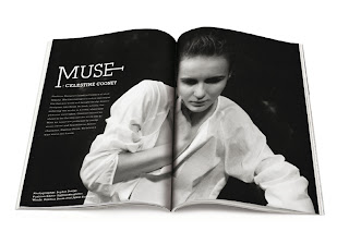
These are all really different but they all have elements which I really like and think work well. I like the use of type and image and the balance that has been created on each page between the two.
In the orange and grey layouts I like the use of the textured background mixed with the graphics and the way they are cut into abstract shapes at different angles, the use of black and white photography and the how the type is not the usual block and its cut into abstract shapes to coincide with the other shapes on the page. Also the simple use of colour, sticking with the grey scale photography and just introducing one strong colour with one another muted background colour works very well.
Next step is try my own layouts...


No comments:
Post a Comment